MMCC's
PL/B notes
Notes home
Intro
History
Article index
v1.10
509 Center
Bay City, Michigan
Sales (989) 892-9242 Support (989) 686-8860
TOOLBARS
|
|

|
MMCC's PL/B notes Notes home Intro History Article index v1.10 |
509 Center Bay City, Michigan Sales (989) 892-9242 Support (989) 686-8860 TOOLBARS
|
WINDOW Tool BarsTOOLBAR
A tool bar is basically a collection of TOOLBUTTONS.METHODS
It's easiest to establish the TOOLBAR in the designer. You can populate it with buttons there or you can do it from your program.
Once the toolbar is populated with buttons and is active, buttons respond to the CLICK event. Like other objects created by the forms designer, the event information that you need is found in LOCAL variables within the form itself. If you want this information in your mainline program, you have to capture it yourself within the code in the form.
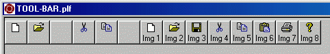
Our practice is to capture information on the CLICK event as follows:MOVE "TOOLBAR-CLICK",ACTION MOVE #EventType, EventType MOVE #EventResult, EventResult MOVE #EventObjId, EventObjId MOVE #EventChar, EventChar MOVE #EventMod, EventModWARNING: The EventResult is the value of the "TAG" that is associated with the button when it is created. That value can be anything that you want. It is a number. Our test program uses a ONE BASED index number for the buttons, which is easier for a person to understand. All ToolBar buttons use ZERO BASED indexes for handling buttons. PAY ATTENTION!The TOOLBAR is managed via methods. You can populate the toolbar within the PLFORM, but you may also want to do it within the program. :IMAGES
- AddButton method.
[label]	{object}.AddButton [GIVING {return}]
      USING [*AutoSize=]{autosize}:
            [*BtnStyle=]{btnstyle}]:
            [*Enabled=]{enabled}]:
            [*ImageIndex=]{imageindex}]:
            [*PartialPush=]{partialpush}]:
            [*Pushed=]{pushed}]:
            [*Tag=]{tag}]:
            [*Visible=]{visible}]:
            [*Text=]{text}]:
            [*RunName=]{runname}]:
            [*ToolTip=]{tooltip}]:
            [*MenuText=]{menutext}]
This seems to always add to the END of the tool bar. The *TAG property gives an identifying number to the button. From what we can tell, the tag should be a number that tells you the position of the button in the took bar because this is the number you get on a click!
When we build a tool bar we keep a count of the buttons as we add them. That number goes in the TAG property. When we get a click we know the tag and that gives us the number so we can get the button properties.
- GetButton method
[label] {object}.GetButton [GIVING {return}] USING [*Key=]{key}]The RETURN item is a TOOLBUTTON object. After you get this button, you can do GETPROPs against it to learn it's details, if required.
The *KEY can be EITHER the Run Name of the button or the zero-based position of the button.
Since you'll normally want to get buttons in response to a click, you'll need the zero-based position. I have no idea how you'd get the "run name" in response to a click.
The CLICK event returns the TAG of the button. That can be anything you want. You could give every button the same tag value. If you do that, you won't know the specific button that was clicked. Our practice is to ADD Buttons sequentially and make the TAG the same as the position.
- RemoveButton method
[label] {object}.RemoveButton [GIVING {return}] USING [*Key=]{key}]
- SetImageList method
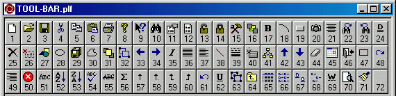
PLBWIN provides a standard image list (shown below). If you don't do anything yourself, that is the list that will be used for the tool bar.
You have the option of creating an image list of your own and assigning that one to the tool bar. When you do that, the images from this list will be used.
- SetImageListDisabled method
This is a second image list associated with the tool bar. When you disable the entire toolbar, all the images are changed to the ones in the corresponding positions in this list.
- SetImageListHot method.
Like the disabled list above, this is a third image list for the "HOT" state of the toolbar. We've not been able to get a definition of "HOT" is.Images associated with buttons are based on an image list. The designer provides a standard list that can be used if you don't want to do your own list. The images from that list are shown below.TOOLBAR BUTTON EDITOR in FORMS DESIGNER
If you want to build your own image list, that can be done. You can add any bitmap icon that you want to that list.
If you want both your own icons AND the ones that are provided by PLBWIN, you can do that with the following procedure.The problem with adding icons one at a time is that those icon files must be available at runtime. If our case, we're distributing programs to users and don't really want to also be distributing a bunch of icons. But there is a solution: The designer lets you add images and icons to a "resourse" that becomes part of the PLFORM. When you add icons to the image list by number, these come from your resources for the form! (See the discussion of this in article 620.)
- In the forms designer, use TOOLS/RESOURCES to add icons to the PLFORM's resources.
- At runtime, in your program:
- Do the FORMLOAD to have the resources available.
- Create your own image list object.
- Use the LoadStdToolBitMap method to load the standard icons into that list.
- Use the AddIcon method to add your own icons to the list.
The standard list had 71 icons last time we looked. The icons you add will follow those and become 72, 73, etc.
MATTHEW'S ROUTINE:
Stephen,

I thought I mentioned that but I must have edited it out before sending it ;)

Anyway, to protect yourself against changes in the default imagelist, here
is what I do:

( code copied from the IDE main window load event)

Load_MainWin
buildico        form    2
execico         form    2
         create  toolimgs
         toolimgs.LoadStdToolBitMap
.
. result is the resource id of the icons being added
.
         set     result  ; I use resource id's one and two
         toolimgs.Addicon giving execico using result
         incr    result
         toolimgs.Addicon giving buildico using result
.
. the imagelist.addicon giving parameter is a 0 based index
. and the ImageIndex parameter for toolbar.buttons
. is a 1 based index
.
         incr    execico
         incr    buildico
.
. now set the toolbar buttons image index
.
         projToolBar001.SetImageList using toolimgs
         setprop projToolBar001.buttons(btnBuildDebug),ImageIndex=buildico
         setprop projToolBar001.buttons(btnBuildExecute),ImageIndex=execico

         RETURN

In my code above, the two buttons that have custom icons have their image
index set at runtime using the index values returned buy the AddIcon
method.  This way, if the index changed in the future, the program
automatically adjusts itself to use the correct index.

Matthew
STANDARD IMAGES PROVIDED BY PLBWIN
 TOOLBAR EVENTS
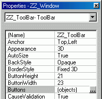
You can add buttons to the toolbar using the forms designer. Look for the "Buttons" line in the properties tool panel for the toolbar. Click on the little "three dot" button on the right end of that line. (If the "three dots" are not shown, just click anywhere on the line and the dots show up.
When you click the "three dots", the "BUTTON COLLECTION EDITOR" window opens as shown below.
Clicking on the "ADD" button on this panel adds a new tool button to the list. The button is named "ToolBtnNNN". The NNN is a sequential number as the buttons are added.
The buttons have no image when added. To assign an image to button, you enter a resource number in the "Image Index" slot on the detail properties to the right. The images are icons from the default image list mentioned above. At run time you can use the SetImageList method for the toolbar to change to an image list that you build yourself. When you do that the buttons immediately change to those in the list you named.
To remove a button from the list, click on that button in the list at the left and then click the "REMOVE" button at the bottom.
You can move the position of a button by clicking on the button to select it then clicking the UP/DOWN arrow buttons to move the selected button up or down the list.
The buttons shown in your tool bar change immediately as you change their position, image index or other properties in this panel.
TOOLBAR / TOOL BUTTON PROPERTIES
- CLICK:
- The Event Result is the tag property of the TOOLBUTTON clicked.
- The Event Modifier is the menu item of the TOOLBUTTON click.
- DOUBLE CLICK
- MOUSE DOWN
- MOUSE MOVE
- MOUSE UP
Getting and Setting properties for buttons is done at the collection level. That is, you identify the toolbar collection with a "." and Buttons: MyToolBar.Buttons
[label] GetProp {object}.Buttons({key}),{property}
        GetProp MyToolBar.Buttons(3),PUSHED=1
PUSHED / PARTIAL PUSHED
Buttons can be pushed or partially pushed. Pushed is obvious, partially pushed is a gray state.
Clicking on a button momentarily changes the state to a variation of "pushed". When you release the mouse, the button comes back out. If you want it to STAY pushed you'll have to set the pushed property after the button has been clicked.
When the button is in the "Pushed" state, clicking or holding the mouse button does not change the look of the button.
The two states are mutually exclusive. If you set pushed, then try to set partial push, nothing happens. To be safe, you should set both PUSH and PARTIAL PUSH to OFF prior to setting the state that you want.
Normal
Pushed =1
PartialPush = 1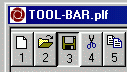
Holding mouse button
over Normal button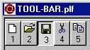
Holding mouse button
over Pushed button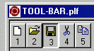
Holding mouse button
over Partial Pushed button
See also:
- IMAGE LISTS.
- RESOURCES.
- ICONS where resources are used.
- BUTTONS where resources are used.
- Tool Bars where an image list is used.
- ICON/RESOURCE summary.
|
v1.10 |
Send e-mail to MMCC. |