

CONTENTS (old style)
TRY FOR THE SPACER
509 Center
Bay City, Michigan
Support (989) 326-2303
PLB_Script: Plb-0276.cfm v1.0
- HISTORY of PL/B and Databus
- BASICS of PL/B programming
- MMCC Standards
- PL/b Forms Designer
- Anchoring objects
(as part of split screen discussion)
-
API Notes on Windows API calls
-
ASCII Good table of codes
-
BINARY LOGIC.
-
BUTTONS.
-
Base 64 encoding
An article by John Walker, founder of Autodesk, Inc. and co-author of AutoCAD. From Fourmilab Switzerland.
-
CALL/CALLS
and Subroutines including ROUTINE, LROUTINE, PROCEDURE, and LOADMOD
- Character Mode Forms
DOS-style, character mode screens
- CLOCK
(Get's lots more than just the time!)
-
COLORS
 COMBOBOX
DATALIST.DIR method to fill a datalist also works with Combo.
- CONTROLs and Objects
- CPU USAGE
notes and comments
- Cursor Keys
notes on detecting cursor keys, etc.
- Sunbelt's History of Data Access
- DATALIST general topic
DATALIST.DIR method to fill a datalist with file directory
- DISPLAY general topic
- Distributing programs
& Runtime considerations
- Docking Objects
(as part of split screen discussion)
- DOS
DOS-style, character mode screens
- EditText (RichEditText)
- E-Mail notes
- EXPLODE instruction
- Events
notes on cursor keys, etc.
- Executing programs
What Program to Load 1ST
Comments on executing compiled programs and systems.
- Expressions
such as:
IF ((QUANTITY * POUNDS_EACH) > CART_MAX)
- FILES
Notes on opening files
FILELIST for managing multiple indexes
FINDFILE/FINDDIR for gathering information about a file
DATALIST.DIR method to fill a datalist with file directory
Image File Types
GETFILE
READ
Sunbelt's History of Data Access
- FILE MANAGER
- FLOATMENU and RIGHT CLICK
- FOCUS and VALIDATE
- FONTS
- FTP from PL/B
- GETFILE
- GETINFO
- GETMODE
Lots of good information including names of INI files
- GUI vs Procedural Comments and notes
- ICONS
- INIT / Literals
- IMAGE LIST
- Standard Includes
- INI FILES
Image File Types
GETMODE INI file names
CLOCK INI data items
PLBWIN License data
- LICENSE
PLBWIN License data
- ListView
-
LOADMOD
including ROUTINE, LROUTINE, PROCEDURE, CALL and CALLS
- MENUS
- NUL strings
- OPENING FILES
Notes on opening files
FILELIST for managing multiple indexes
DATALIST.DIR method to fill a datalist with file directory
- O'Reilly Website
Notes on the tests we ran YEARS AGO.
- Panel object (and split screens)
- Percent PROGRESS
- PICTURES
- PRINT SCREEN (Printing a form)
- PRINT
DOS style printing direct to LPTx
- PRTOPEN PDF
PDF built into 9.6
- PRTPAGE
Selecting and opening a printer
*UNITS
*PICT
Printing a screen image
Printers (names, managing, etc.)
- Program Distribution
& Runtime considerations
-
RESOURCE lists.
Embed pictures, movies, etc. into your PLC.
-
REVDATE
application program version control
- RichEditText (EditText)
-
ROUTINE
including ROUTINE, LROUTINE, PROCEDURE, CALL and CALLS
- RUNTIME : PLBWIN runtime considerations
- RUNTIME VERSION See CLOCK VERSION
- RIGHT CLICK and FLOATMENU
- SCREEN HANDLING:
- .SHOW show/hide window
- Manual SCROLL BARS
- Splitter object
- Split Screen Windows
- Print Screen
- See also Window topic
- SOUND FILES
Playing music, etc.
- SQLIO SQL Lite support within PL/B
- STRINGS
- SDB386 and SUNDBCMP
- Standard Includes
- Subroutines
including ROUTINE, LROUTINE, PROCEDURE, CALL and CALLS
- TAB CONTROL
- Toolbar / Toolbutton
- TreeView
- Transactions
- Program execution
What Program to Load 1ST.
Comments on executing compiled programs and systems.
- Techniques and Comments
getting sample code
multi-line stattext
layered objects
zorder
radio group
UTF-8UFT-8 format
- VALIDATE and FOCUS
- VERSION control
GETMODEprogram & compiler versions
CLOCKrumtime version
- VERTICAL SCROLL BARS (manually coded)
- WINDOW OBJECTs
hiding the window (.SHOW)
controlling position on screen
stretching and shrinking window and all objects
See Screen Handling topic
- Xfiles
X-file notes - SCREEN HANDLING:
plb-t010.cfm rev 2/05/2026 17:09
ANSI Standard PL/B Language and Visual PL/B
BUTTONS
We find very few reasons to create buttons ourself within the code, but it is not difficult. An example is:
[label] CREATE [{parent};]{button}={top}:{bottom}:{left}:{right},{name}:
                {property list}...]
        ACTIVATE {button},{click-routine},{result}
        SETPROP  {button},ICON={resource # or image filename}
            . . . .
button_click EVENTINFO ZERO:       //get info for current event
             CHAR=EventChar:       //character that caused the event
             MODIFIER=EventMod:    //modifier key or mouse button clicked
             OBJECTID=EventObjID:  //event type
             RESULT=EventResult:   //9 digit #: click type, H, V positions
             TYPE=EventType        //click, dblclick, etc.
In the above example, {name} is the text that appears on the button. This can include a "hot key" designation using the & character: E&XIT which is visually presented as EXIT.
Buttons respond to just one event: the CLICK. When that happens, the {click-routine} is called and you can do whatever else you want.
To process other events you must EVENTREGISTER them and handle them yourself.
 Buttons normally have TEXT associated with them. The text can use various properties and fonts to be visually effective. Buttons do NOT have background or foreground color properties.
 Buttons can also have IMAGES on them and work much like ICONS.
When you use an image you have to do a SETPROP ICON={resource # or image filename}. BMP and GIF image files seem to work. Others might too.
Buttons can also have IMAGES on them and work much like ICONS.
When you use an image you have to do a SETPROP ICON={resource # or image filename}. BMP and GIF image files seem to work. Others might too.
When an ICON is associated with a button, the text is hidden by the icon image. If the icon is removed (via SETPROP ICON=""), the text appears again.
Remember that if images are used, they have to be distributed with your programs. Resources, on the other hand, are part of the program itself.
RESOURCES are attached to the PLFORM. There is a standard set of resource ICONs provided by PLBWIN and you can add your own to that list. This is the prefered way to put images on buttons and icons because the images become part of the program itself.
(Note that you can NOT use an IMAGE LISTS for an ICON. That's too bad because the PLBWIN standard image list includes 70+ icons, many of which would be great for an ICON.)
|
Numbers 1,2,3 were created from our own icon files using the RESOURCES tool in the Designer. Resource 100 and the series from 10020 to 10143 were provided automatically by PLBWIN. 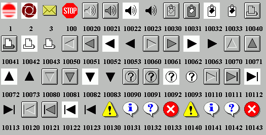
Display created by UTIL-PLB\RESOURCE.PLS |
See also:
- IMAGE LISTS.
- RESOURCES.
- ICONS where resources are used.
- BUTTONS where resources are used.
- Tool Bars where an image list is used.
- ICON/RESOURCE summary.
v1.10
Write to MMCC Technical Support at: Send e-mail to MMCC.
MMCC - Technical Support
600 W. Midland
Bay City, MI 48708
(989) 686-8860
600 W. Midland
Bay City, MI 48708
(989) 686-8860